Why we created UI 2.0
UI 2.0 is the next evolution of Starshipit, built on a modern foundation that enables:
- Faster updates: Our teams can deliver new features more frequently
- Improved accessibility: Better experience for all users
- Enhanced performance: More responsive while offering more functionality
- Your feedback: Incorporating the improvements you've asked for
Moving to UI 2.0
If you'd like to check out the new platform, we've made this super easy.
- Log into Starshipit with your usual Starshipit credentials.
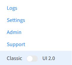
- In the bottom left of the navigation menu, you'll see a toggle to switch to UI 2.0.
- Selecting this will redirect you to our new interface.
Moving to Classic UI
If at any point you'd like to return back to the original application, you can change back by:
- Log into Starshipit with your usual Starshipit credentials.
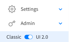
- In the bottom left of the navigation menu, you'll see a toggle to switch to Classic UI.
- Select Switch to classic UI.
- You will be redirected back to Starshipit Classic.
Print Application
If you currently use the Print Application you will need to download the our new print app for UI 2.0 to be visible. Please note, UI 2.0 is currently only supported on the Windows Print App.
- In Starshipit, go to Settings > Printing > Download Starshipit Desktop.
- Complete the installation wizard, this will prompt you to uninstall the old version.
- Log into the application with your Starshipit credentials.
- In the top navigation bar select Version > Starshipit 2 (new UI).
- You may need to set up your printing settings again. You can do this by following the above linked guide.
Major Updates
UI 2.0 feels like an upgraded version of a platform you're already comfortable with. Here's what's new:
| Feature | What's new |
|---|---|
| Edits from grid | Make quick changes directly from the orders grid: update package type, address details, items, courier, and service code. |
| Order Grid | • See full destination details: company name, estimated shipping price, package used, shipping paid, item quantity, notes, bin location • Customisable columns: Hide, display, or rearrange. Preferences are saved • Grid View Options: Click the cog icon to choose Compact View (single line) or Expanded View (extended row) |
| Order Details | New sections when opening orders: • Sender/Receiver: Addresses on the right side (click pencil to edit) • Shipping Breakdown: Dynamic quote breakdown from the courier • Package Views: New "Single Package View" for managing multiple packages • Items: View Bin Locations, Mid Codes, Brands (use product catalogue for auto-population) • Additional Details: Insurance value and reference data • Tax Details: Receiver tax info for international orders • Customs Details: Incoterms, attached documents for international orders • Order Notes: Add processing notes (e.g., "add a gift note") |
| Analytics | Shipping analytics to analyse shipping metrics, improve delivery experience, and make data-driven decisions. Track if carriers are meeting delivery KPIs. |
| Tags | Add tags to orders for easier organisation and management. |
| Workflows | Quick Print is now Workflows. • New terminology: "Print order" → "Scan and print", "Open to order details" → "Scan and open" • Packing validation: Scan barcodes to verify items belong in the order • Scan to select packaging/carriers: Update package type, courier, and print • Search/print from child accounts: Access orders across linked accounts • Reprint orders: Easily reprint previously printed labels |
| Suggested Merges | Suggested Merges recommends orders to combine when they share the same destination. Consolidate shipments and cut costs. UI 2.0 exclusive. |
| Scheduled Reports | Scheduled Reporting: Set up automated daily or weekly report deliveries for consistent account overviews. |
| Order Navigation | • Forward/back buttons in the top right of order details • "Print and next" button: After printing, immediately shows the next order |
Minor Updates
| Feature | What's changed |
|---|---|
| Search | Moved to the top right. Search by customer name, order number, or tracking number from anywhere in the app. |
| Account Details | Plan management, billing, logout, and support are now in the user dropdown. Access via the blue arrow next to your username (top right). |
| Actions Menu | Displays at the top when you select orders from the grid. Includes familiar actions plus new ones like add/remove tags. |
| Individual Order Actions | Two menus when viewing orders: • Print menu: All printing options • Actions menu: Resend, Clone, Book Pickups, etc. |
| Validating Addresses | • Bulk: Select Check Addresses (top right) to see only invalid addresses, then bulk or individual update • Single: Click pencil next to address, then "check address" in bottom right |
| Switching Accounts | Click username (top right) → Switch Accounts. Includes search filter for users with many child accounts. |
| Booking Pickups | Use the actions menu. Pickup history has moved to its own page in the left navigation. |
| Packed Orders | Printing a packing slip automatically adds the "packing slip printed" tag for easy identification. |
Share your feedback
We welcome your thoughts on UI 2.0. Leave feedback on our dedicated UI 2.0 product board or contact our support team for assistance.