# Shipping analytics
URL: https://support.starshipit.com/articles/6269438607887-shipping-analytics
Canonical: https://support.starshipit.com/articles/6269438607887-shipping-analytics
Markdown: https://support.starshipit.com/articles/6269438607887-shipping-analytics.md
Updated: 2026-05-07
> For the complete documentation index, see [llms.txt](https://support.starshipit.com/llms.txt).
> Analyze shipping metrics to improve delivery performance and make data-driven decisions about carrier performance.
With shipping analytics, you can analyse multiple shipping metrics to improve your delivery experience and make data-driven decisions. For example, view real-life shipping performance data from your business to learn if carriers are meeting key shipping delivery KPIs. There are two dashboards: Shipping summary and Shipping performance.
Multi-workstation accounts do not have access to this feature.
## How you can use shipping data analytics
* Analytics helps you to identify the reasons behind certain shortfalls in carrier performance. Use these insights to have informed discussions about delivery timeframes with your carriers.
* Incorporate shipping performance data into your current reporting processes with the option to export the data into tools like Power BI or simply use the report builder feature to create your own outputs.
## 1. Shipping summary
The shipping summary screen shows you a summary of your order volume split by platform and carrier. You can filter the views on this page by choosing a time period range from the drop down at the top of the page.
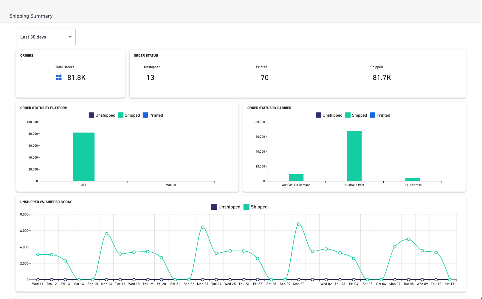
There are 5 different views on this page:
### Orders
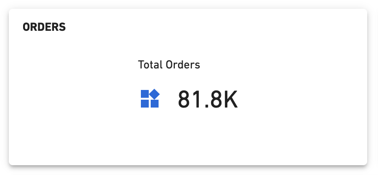
Total number of orders created.
### Order status
Total number of orders unshipped, printed and shipped.

### Order status by platform
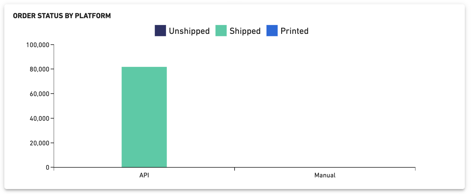
Total number of orders unshipped, printed and shipped by platform, displayed in a bar graph format.
### Order status by carrier
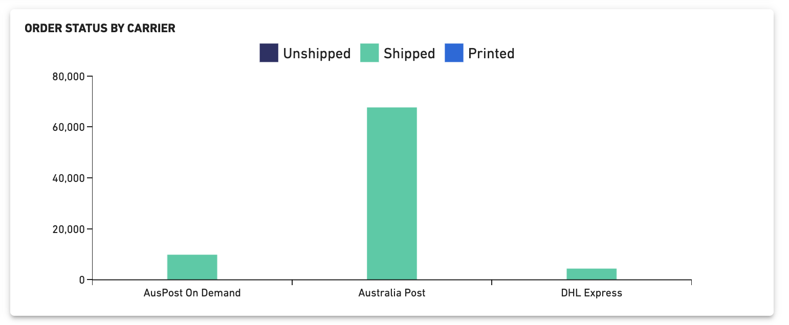
Total number of orders unshipped, printed and shipped by carrier, displayed in a bar graph format.
### Unshipped vs shipped by day
Total number of orders unshipped versus shipped by day.

### Order status by child account
Total number of orders in multi-location, 3PL and full access child accounts.

## 2. Shipping performance
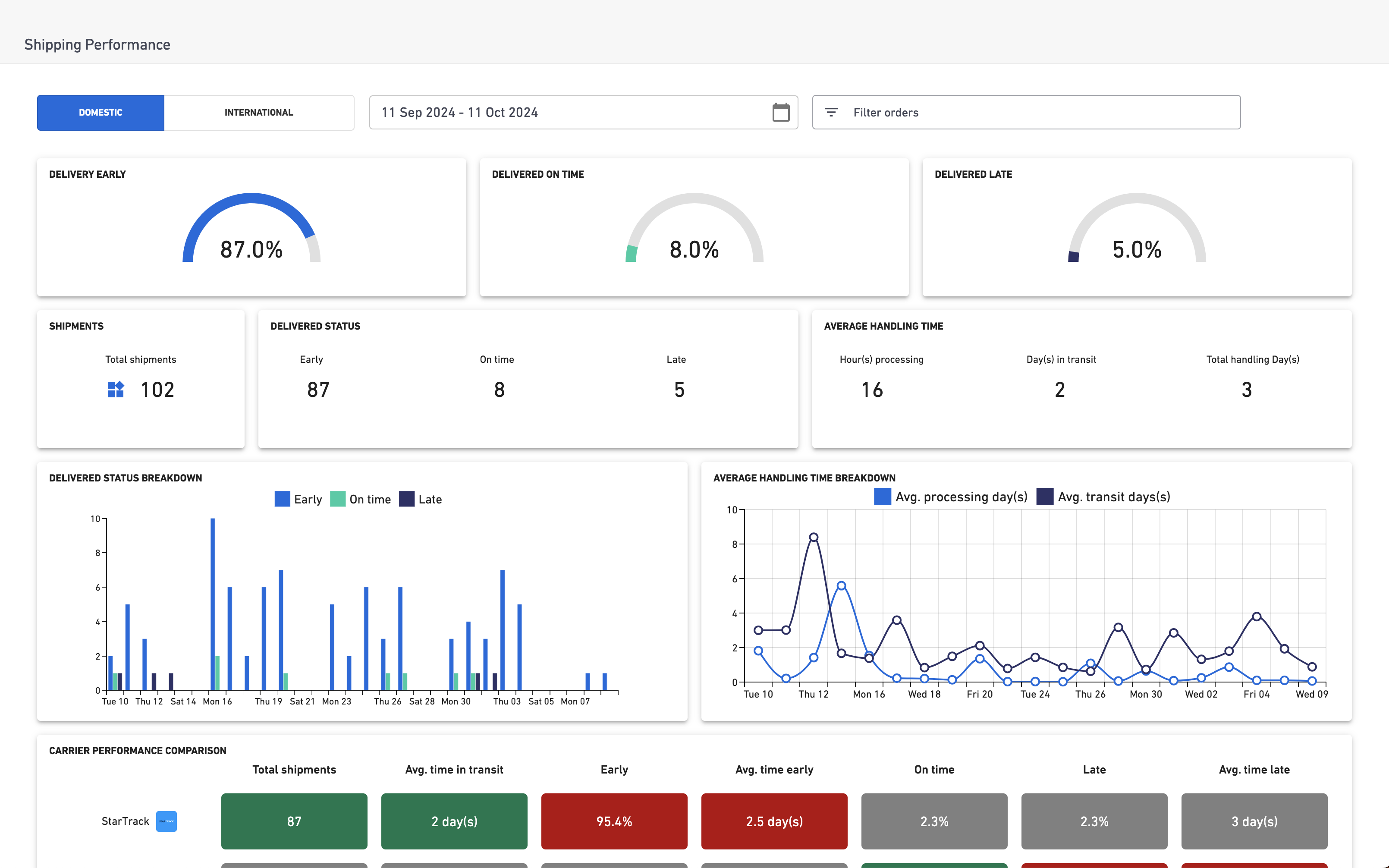
Analyse the performance of your different carrier services and learn if they're meeting key KPIs. For example, whether orders are being delivered early, on time or late.
This is currently supported for the below carriers:
* StarTrack
* eParcel
* MyPost Business
* DHL Express
* Team Global Express
### Filter options
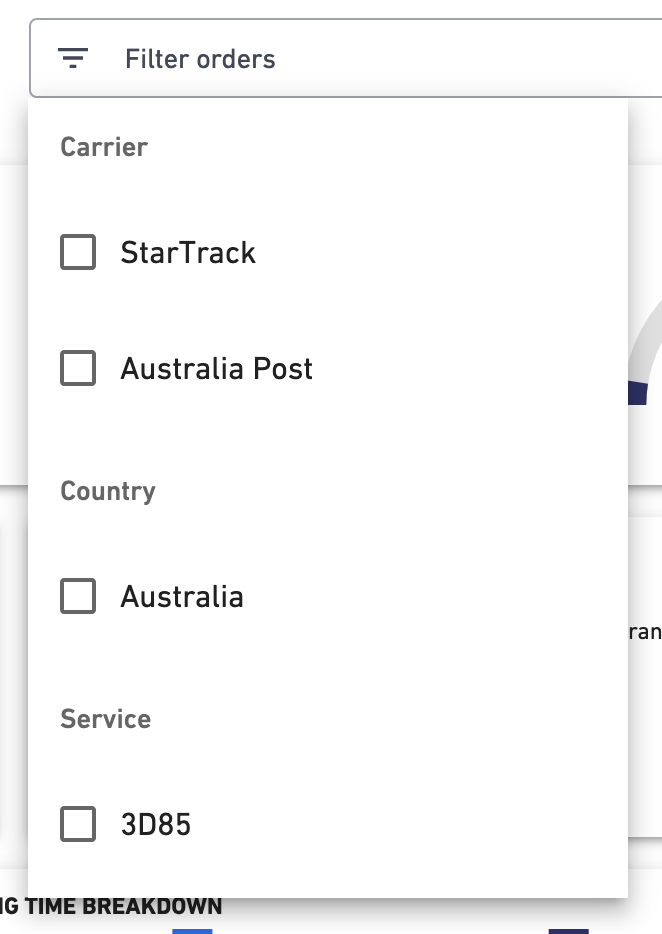
The filter options at the top of the page enable you to segment the dashboard data into different dimensions. This lets you analyse the specific reasons behind why the KPIs on this dashboard are being met (or missed).
The selections you choose in these filters will be reflected in all the visuals on the dashboard. Here are the filters you can apply, and what they mean:
* **Domestic/international:** View either domestic or international shipments in the dashboard.
* **Date range:** Filter all shipments that were created between the start and end date that was selected in the calendar. You can also select a pre-set time period (e.g., Last 30 days).
* **Filter bar:**
* **Carrier:** Filter to view multiple or a single carriers' performance.
* **Shipping Method:** Filter to view multiple or single services such as overnight (expedited), express, etc.
If there are no data points, the filter bar will not return any filter options.
### KPI gauges
The KPI gauges give you insight into popular shipping metrics. The percentage in each gauge is an indication of whether orders are delivered early, on time or late according to carrier data.

### Score cards
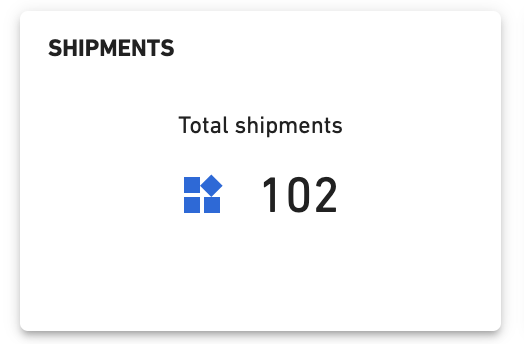
The score cards give you the volume of shipments included in the selected filter, as well as how the total volume is split across key shipping metrics.
### Delivered status
The delivered status score card provides you with a split of the total shipments and how many were delivered as per the various shipping timeframes:
* **Early:** Delivered before the estimated delivery date.
* **On time:** Delivered the same day as the estimated delivery date.
* **Late:** Delivered after the estimated delivery date.
### Average handling time
This scorecard gives you a split of the total packages that have been delivered in the selected filters. It also shows you the average time they were processed in the warehouse, the average time they were in transit and the total fulfilment time (total of warehouse and transit time).
The unit will be displayed in hours if the average time is less than 24 hours or days if the average time is over 24 hours.
### Delivered status breakdown
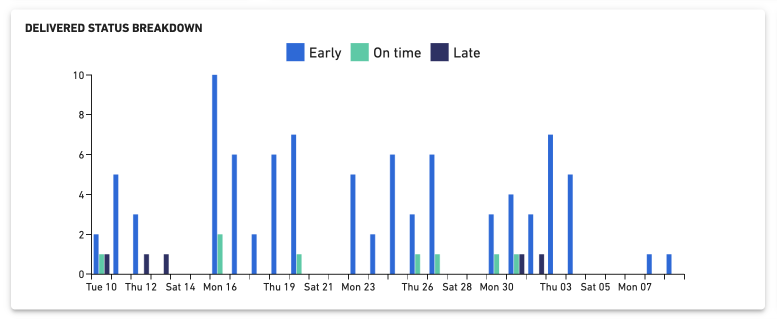
This chart allows you to plot your shipping metrics across a configured time span. For example, work out whether a certain date is responsible for a delay in shipping or if you see spikes in performance on certain days or weeks.
* The X axis represents the shipment dates in the series and the date range will be determined by the start and end date selected in the calendar selector in the filters at the top of the page.
* The Y axis represents the volume of shipments that fall into the date series in the x axis.
* The index represents the split of the number of shipments in the series that were delivered on time, early and late.
This also gives you a clear indication if volume is contributing to missing KPIs.
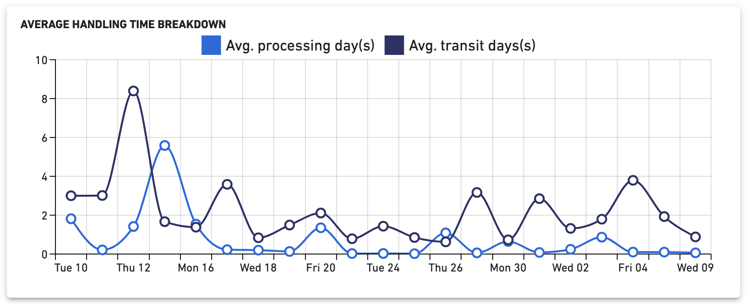
### Average handling time breakdown
This chart gives you an indication of how the average warehouse time and transit time are tracking over a configured time range. This can help you work out whether productivity is trending in the right direction, or if there are spikes in average handling time over specific dates.
* The X axis represents the shipment dates in the series and the date range will be determined by the start and end date selected in the calendar selector in the filters.
* The Y axis represents the Average Handling Time in either days or hours depending on the unit selected.
* The index line represents the Average transit time and Warehouse time and how they are tracking on the specific time series selected.
### Carrier performance analysis
This heatmap lets you compare all the metrics available in shipping performance for each carrier used in the selected filter. This is especially useful when you use multiple carriers on the same route to benchmark their performance against each other. The colour of the cell gives you a clear idea of how carriers are performing.
The columns in the table show the following metrics:
* Total shipments
* Average time in transit
* Early
* Average time early
* On time
* Late
* Average time late

## How you can use shipping data analytics
* Analytics helps you to identify the reasons behind certain shortfalls in carrier performance. Use these insights to have informed discussions about delivery timeframes with your carriers.
* Incorporate shipping performance data into your current reporting processes with the option to export the data into tools like Power BI or simply use the report builder feature to create your own outputs.
## 1. Shipping summary
The shipping summary screen shows you a summary of your order volume split by platform and carrier. You can filter the views on this page by choosing a time period range from the drop down at the top of the page.

There are 5 different views on this page:
### Orders
Total number of orders created.

### Order status
Total number of orders unshipped, printed and shipped.

### Order status by platform
Total number of orders unshipped, printed and shipped by platform, displayed in a bar graph format.

### Order status by carrier
Total number of orders unshipped, printed and shipped by carrier, displayed in a bar graph format.

### Unshipped vs shipped by day
Total number of orders unshipped versus shipped by day.

### Order status by child account
Total number of orders in multi-location, 3PL and full access child accounts. Users have the ability to refresh the chart for up to date data and filter by unshipped, printed and shipped.
## 2. Shipping performance
Analyse the performance of your different carrier services and learn if they're meeting key KPIs. For example, whether orders are being delivered early, on time or late.

This is currently supported for the below carriers:
* StarTrack
* eParcel
* MyPost Business
* DHL Express
* Team Global Express
### Filter options
The filter options at the top of the page enable you to segment the dashboard data into different dimensions. This lets you analyse the specific reasons behind why the KPIs on this dashboard are being met (or missed).
The selections you choose in these filters will be reflected in all the visuals on the dashboard. Here are the filters you can apply, and what they mean:
* **Domestic/international:** View either domestic or international shipments in the dashboard.
* **Date range:** Filter all shipments that were created between the start and end date that was selected in the calendar. You can also select a pre-set time period (e.g., Last 30 days).
* **Filter bar:**
* **Carrier:** Filter to view multiple or a single carriers' performance.
* **Shipping Method:** Filter to view multiple or single services such as overnight (expedited), express, etc.
If there are no data points, the filter bar will not return any filter options.

### KPI gauges
The KPI gauges give you insight into popular shipping metrics. The percentage in each gauge is an indication of whether orders are delivered early, on time or late according to carrier data.

### Score cards
The score cards give you the volume of shipments included in the selected filter, as well as how the total volume is split across key shipping metrics.

### Delivered status
The delivered status score card provides you with a split of the total shipments and how many were delivered as per the various shipping timeframes:
* **Early:** Delivered before the estimated delivery date.
* **On time:** Delivered the same day as the estimated delivery date.
* **Late:** Delivered after the estimated delivery date.

### Average handling time
This scorecard gives you a split of the total packages that have been delivered in the selected filters. It also shows you the average time they were processed in the warehouse, the average time they were in transit and the total fulfilment time (total of warehouse and transit time).
The unit will be displayed in hours if the average time is less than 24 hours or days if the average time is over 24 hours.

### Delivered status breakdown
This chart allows you to plot your shipping metrics across a configured time span. For example, work out whether a certain date is responsible for a delay in shipping or if you see spikes in performance on certain days or weeks.
* The X axis represents the shipment dates in the series and the date range will be determined by the start and end date selected in the calendar selector in the filters at the top of the page.
* The Y axis represents the volume of shipments that fall into the date series in the x axis.
* The index represents the split of the number of shipments in the series that were delivered on time, early and late.
This also gives you a clear indication if volume is contributing to missing KPIs.

### Average handling time breakdown
This chart gives you an indication of how the average warehouse time and transit time are tracking over a configured time range. This can help you work out whether productivity is trending in the right direction, or if there are spikes in average handling time over specific dates.
* The X axis represents the shipment dates in the series and the date range will be determined by the start and end date selected in the calendar selector in the filters.
* The Y axis represents the Average Handling Time in either days or hours depending on the unit selected.
* The index line represents the Average transit time and Warehouse time and how they are tracking on the specific time series selected.

### Carrier performance analysis
This heatmap lets you compare all the metrics available in shipping performance for each carrier used in the selected filter. This is especially useful when you use multiple carriers on the same route to benchmark their performance against each other. The darkness of the cell gives you a clear idea of how carriers are performing.
The columns in the table show the following metrics:
* Total shipments
* Average time in transit
* Early
* Average time early
* On time
* Late
* Average time late
